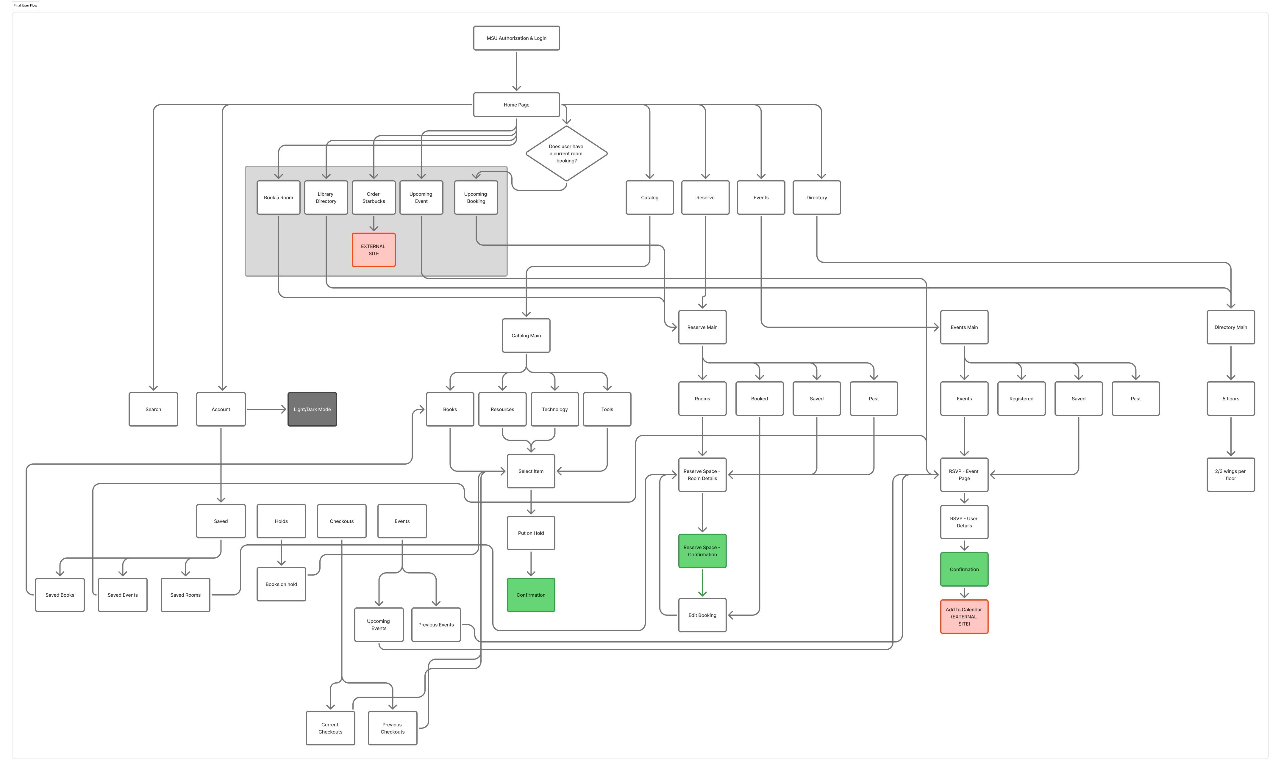
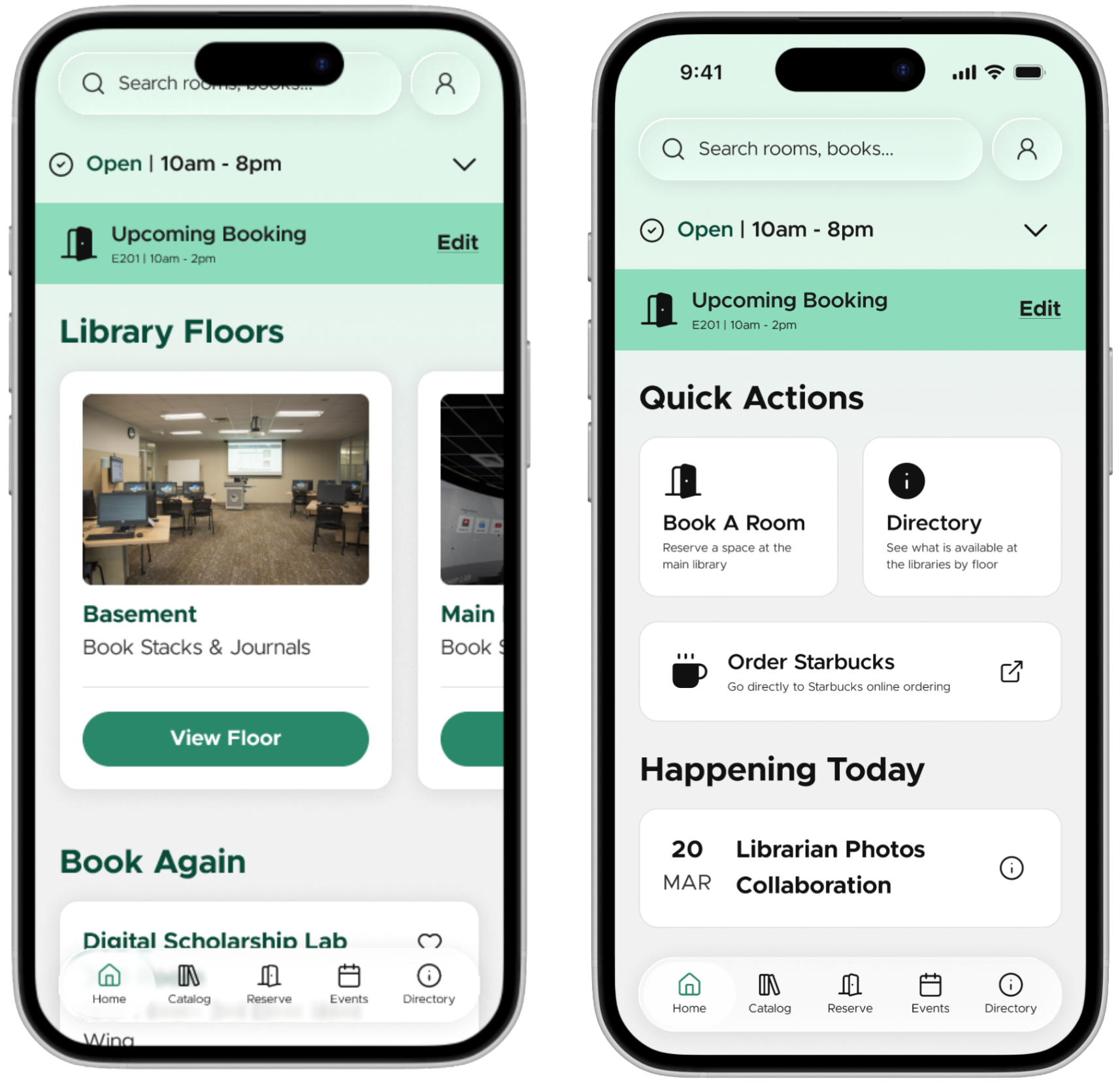
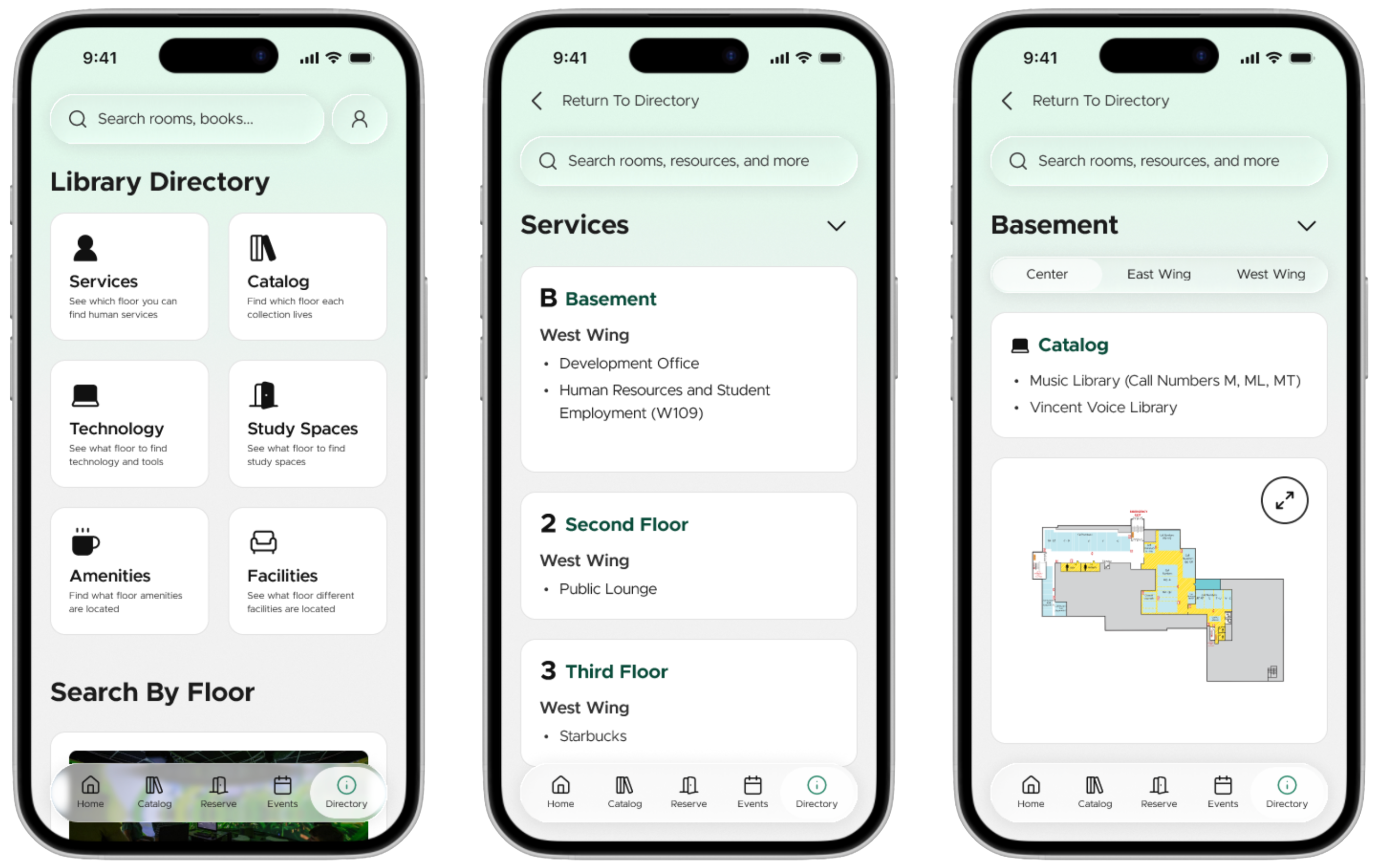
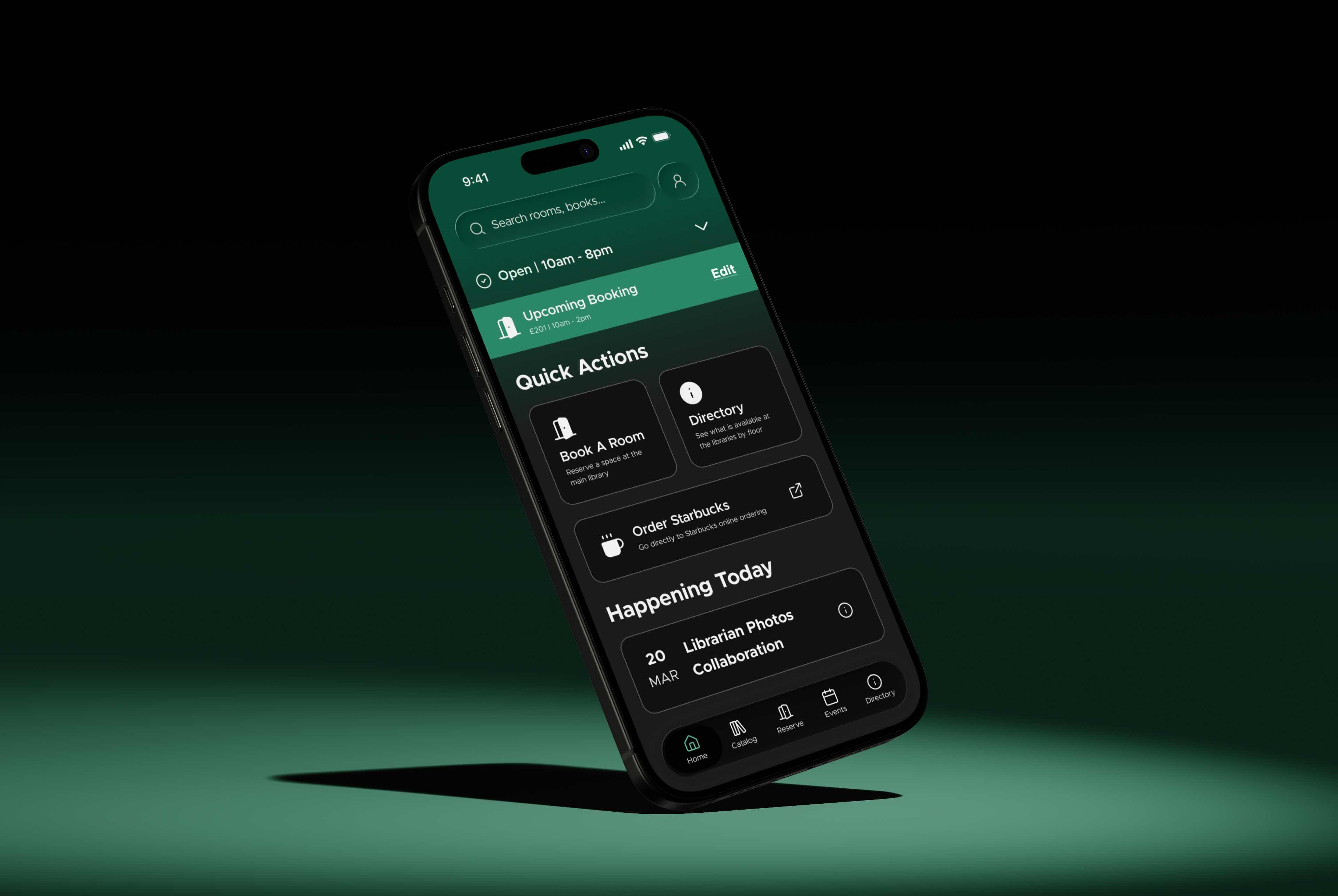
With all of the building blocks in place, it was time to conduct a full user research study. User research was the most important part of this project for many reasons, but the primary one being that it gave us design directions for the application. The project started vague, and the client had ideas for included features, but nothing concrete. Our three part user research study was built with the goal to not only understand the user base and what they struggle with, but what these users might want to see in a mobile application.
During the first part of the semester, the team reviewed different avenues of desk research to better understand our client and direction for the proposed application.
By understanding comparators and current public perceptions of the MSU Libraries, the team is better able to understand the key factors that will make the proposed mobile application stand out within the market – especially since this will be the first app of its kind in the Big Ten Conference.
Literature review focused on public materials relating to the public perception of the MSU Libraries.
Comparative Analysis focusing on both direct competetors and analogous applications.
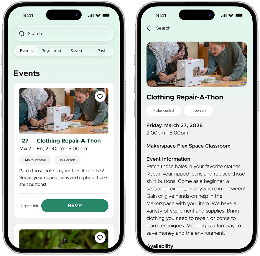
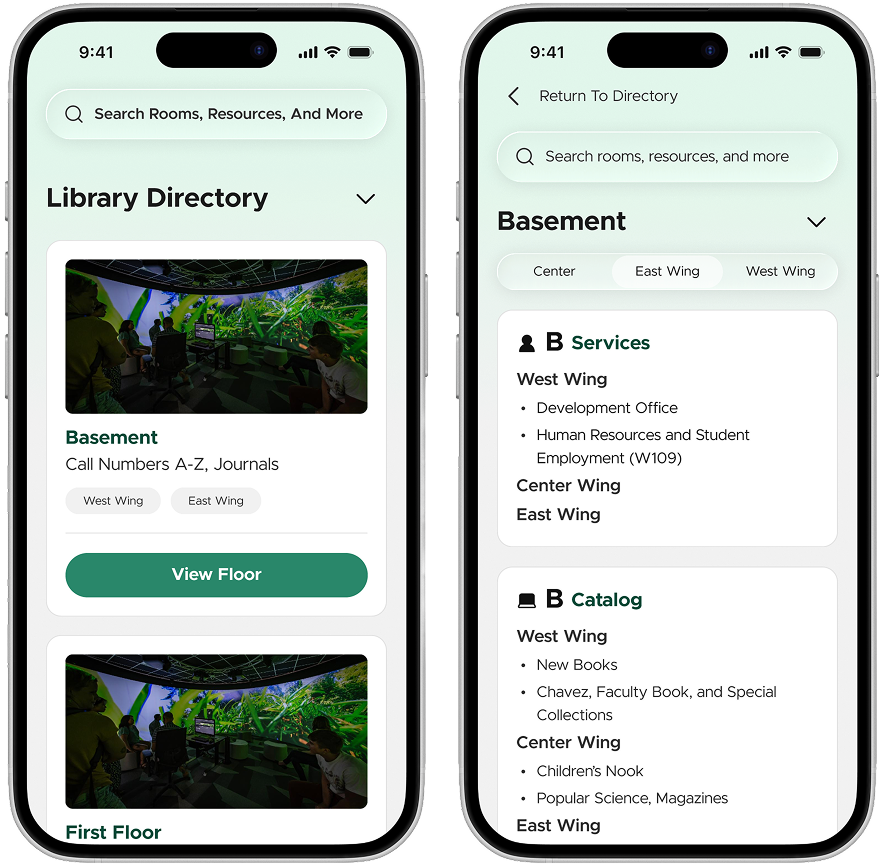
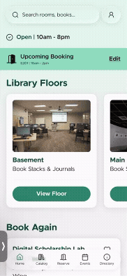
3 direct comparators - Brown University MoBUL, Ex Libris Library Mobile App, Libby
3 indirect comparators - Target Mobile App, Marriott Bonvoy Mobile App, Netflix Mobile App
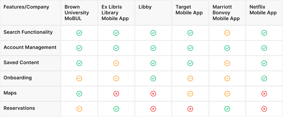
Our analysis of three comparator apps: Brown University’s moBUL, Ex Libris platform, and Libby highlight key takeaways for our project. moBUL provides features like specific course reservations, and “scan a shelf,” setting a high bar for custom campus-specific utility. The Ex Libris platform has very standardized functions: bookings, accounts, and search but often lacks distinctive branding. Libby offers a very user-centered design with its intuitive interface and engaging presentation of digital content.
From these findings we determined we would like MSU Libraries to adopt these features, merging intuitive core functionality with strong integrated academic tools, creating a uniquely valuable and universally convenient experience for the MSU community.
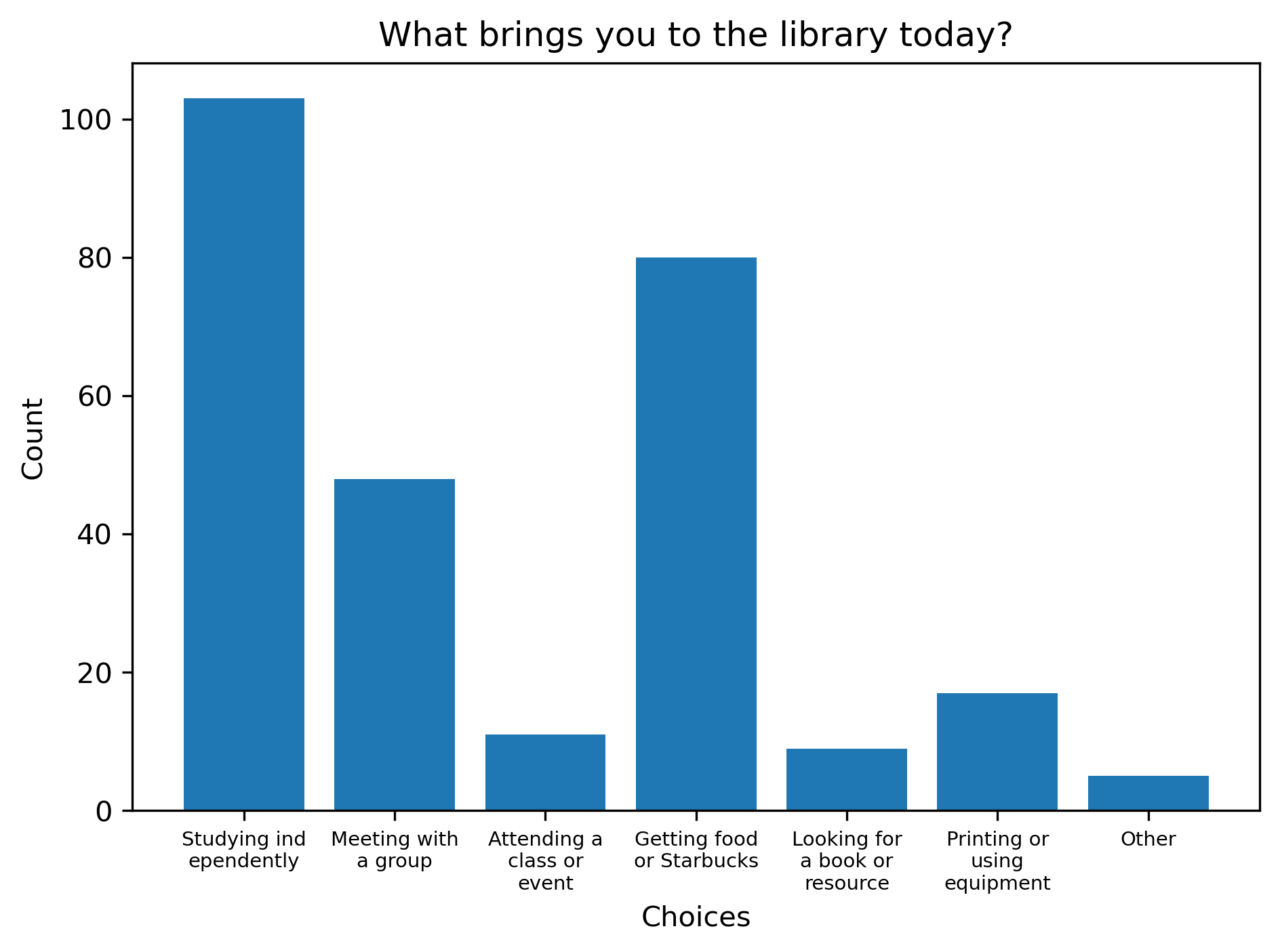
Our team deployed a survey to gather broad insights into how members of the MSU community currently interact with MSU Libraries’ physical and digital services. The survey was designed to identify the primary user groups and understand their current library use patterns and pain points.
At a high level, the screening survey was used to establish a baseline understanding of how students and other members of the MSU community currently interact with MSU Libraries, both digitally and in the physical library spaces. The survey allowed the team to identify broad patterns in usage, awareness, and pain points related to the library’s existing tools and services.
The survey was created on Qualtrics and distributed electronically to the MSU community with support from MSU Libraries. It included a mix of questions that covered demographic information, frequency/purpose of library use (online and in-person), device preferences for accessing library resources, prior experience with library mobile apps, and perceived value of potential mobile app features
Current Library Usage
Most respondents reported regularly engaging with MSU Libraries.
Activities at the Libraries
Primary reasons for library use included:
Device and Platform Prefrences
When accessing the MSU Libraries website:
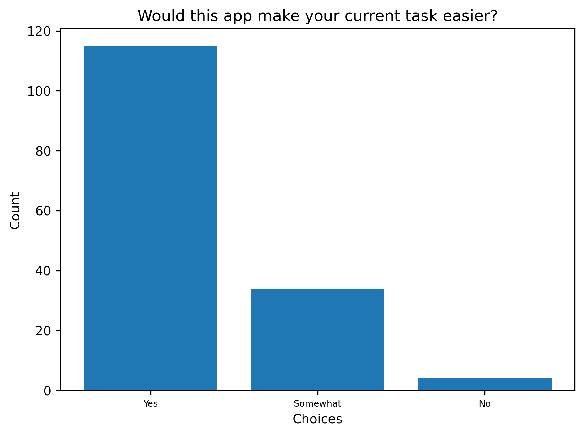
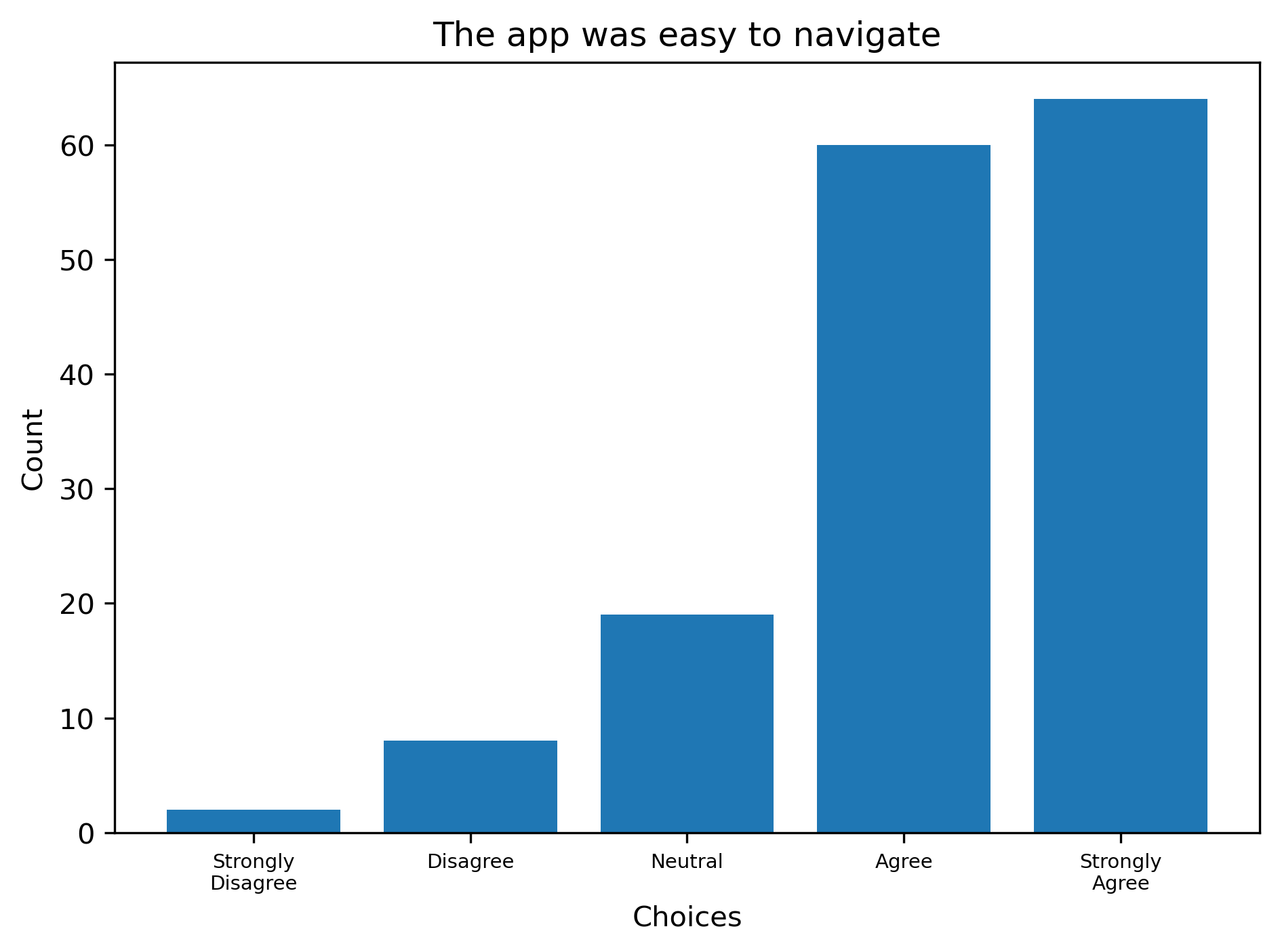
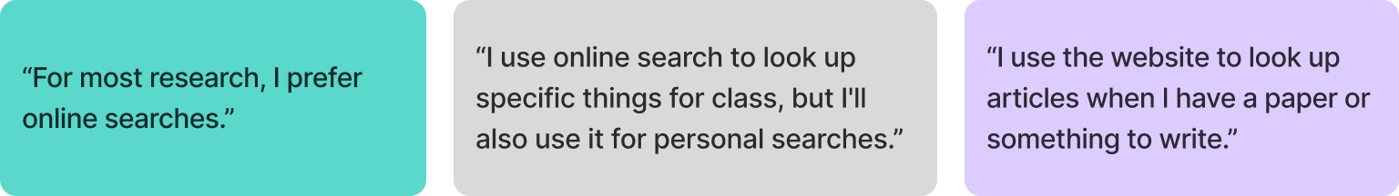
Interest in Mobile App Features
When asked to select the most valuable potential mobile app features, respondents prioritized:
The survey results suggest that students are primarily engaging with MSU Libraries in ways that are often tied directly to coursework or other academic needs. Based on the responses, the library is frequently used as a study space and research resource; however, some awareness of the additional services (such as events) appeared limited. The team noted this as a potential gap between what the library offers and what users are actively recognizing and or accessing.
Using the results of the survey the team created an interview guide with the goal of better understanding how students discover the library’s services, what things may be preventing or challenging engagement, and which interactions would be most valuable to support through a mobile experience.
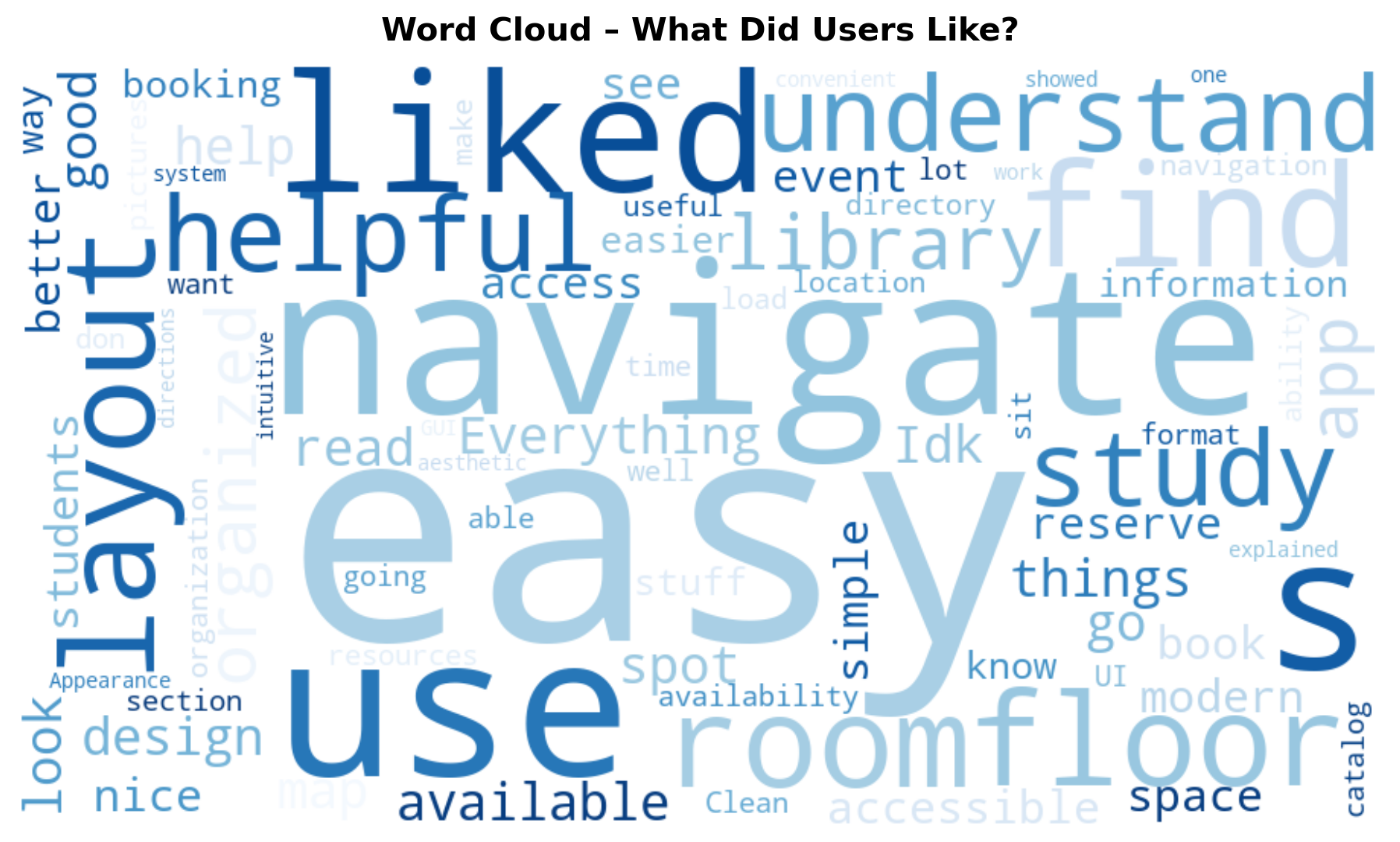
After receiving survey responses, our team conducted 14 semi-structured user interviews to gain deeper, qualitative insights into how members of the MSU community experience MSU Libraries. After completing and transcribing the interviews, our team conducted affinity mapping to organize participant feedback into key themes, patterns, and insights.
User interviews allowed our team to understand users’ current experiences, perceptions, and challenges with MSU Libraries, both online and in-person. Affinity mapping was used to synthesize the qualitative data gathered from interviews, which will ultimately inform user personas and journeys, feature prioritization, and a deeper understanding of our users.
Interview participants were recruited from survey respondents who indicated willingness to participate in follow-up research. Interviews were conducted using a semi-structured format based on our user interview guide, which is linked below. Interviews focused on topics including library usage habits, digital navigation experiences, barriers to accessing resources, and expectations for a potential mobile app. Each interview was recorded, transcribed, and cleaned.
From the affinity maps, the team was able to code the gathered quotes into current usage patterns, issues and concerns, and wishes for a mobile application.
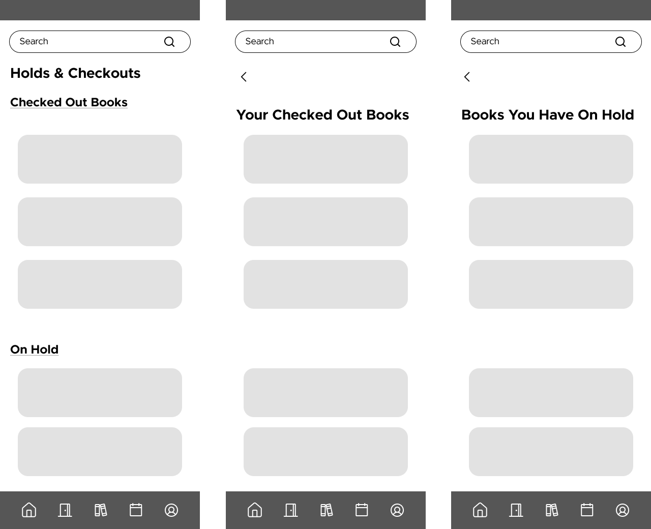
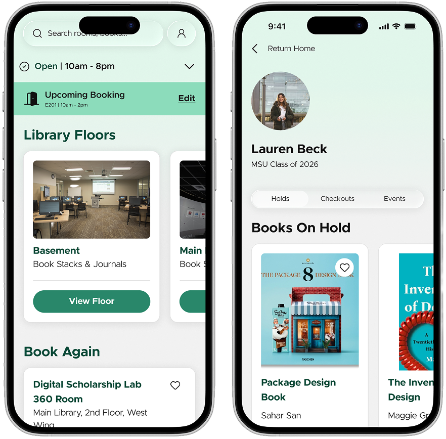
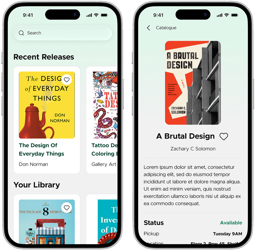
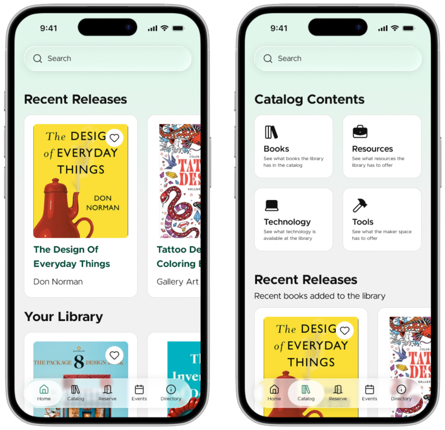
Search Functionality
High Priority

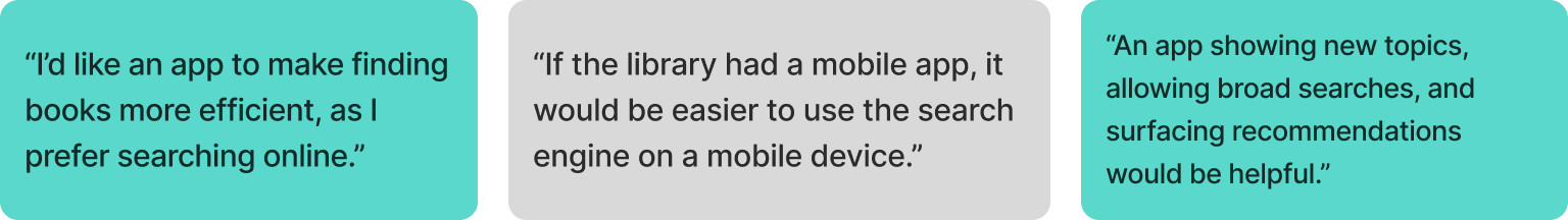
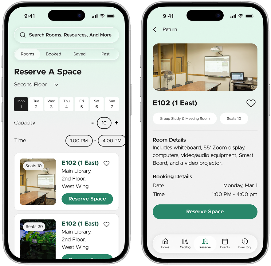
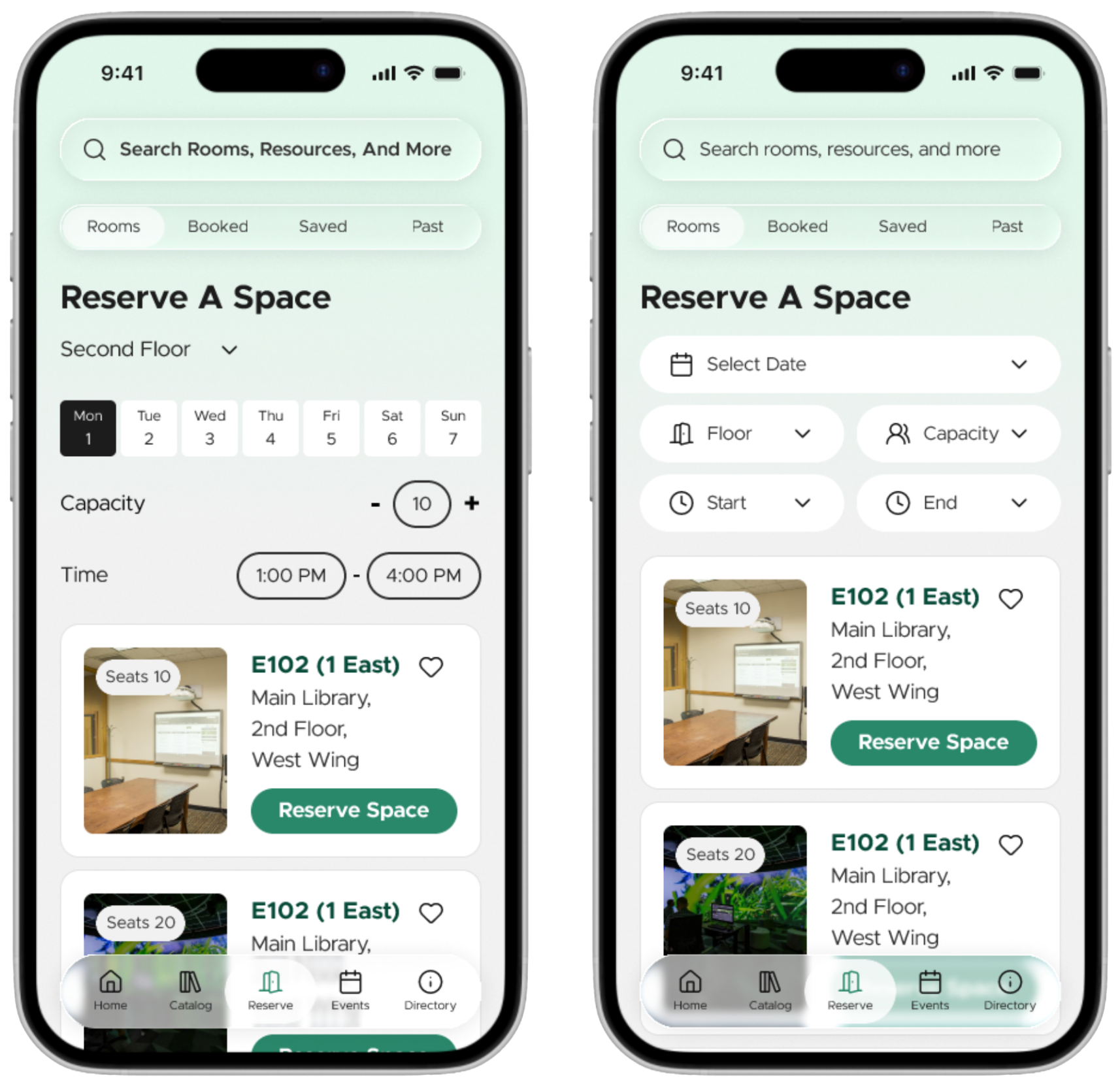
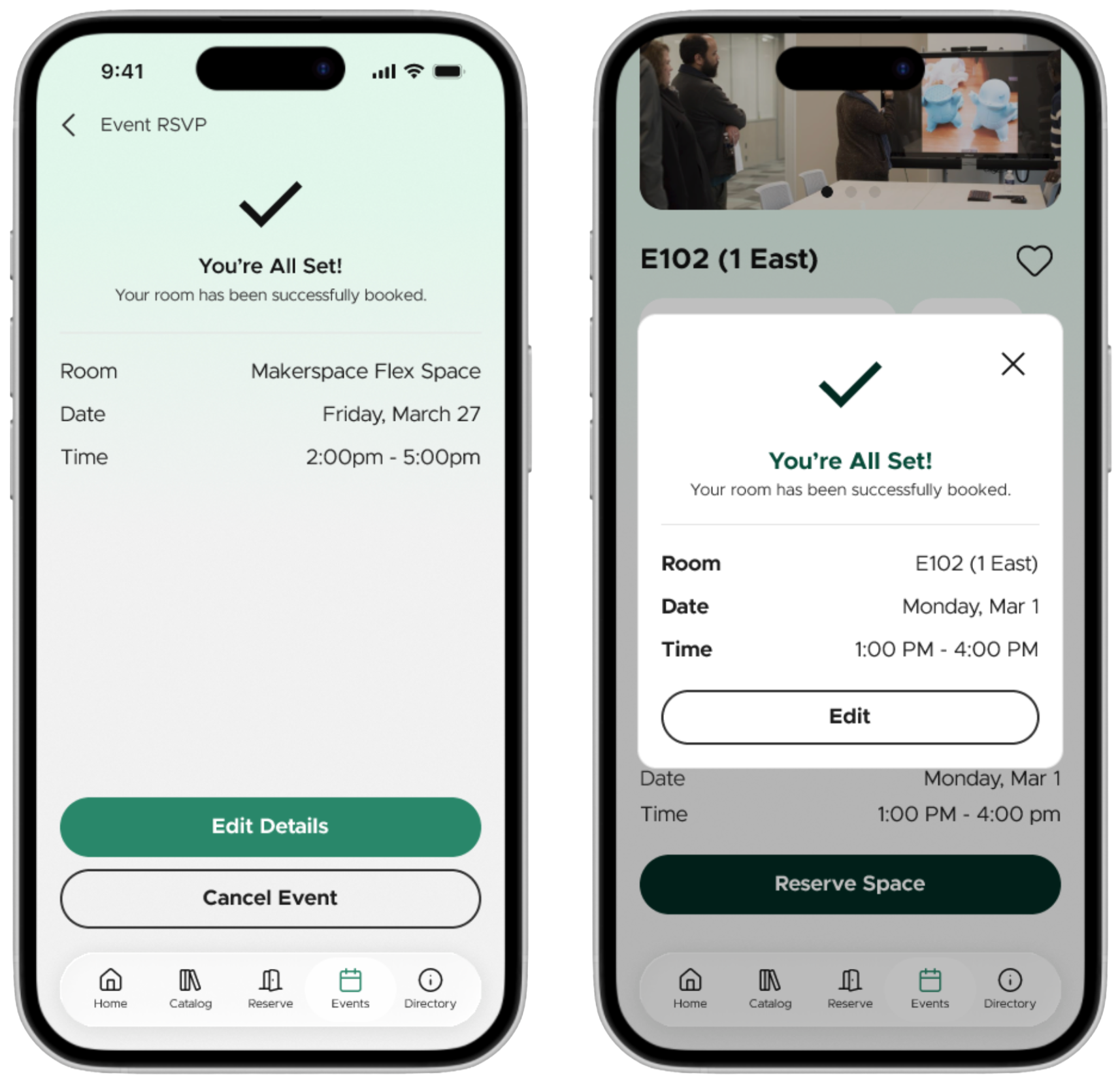
Room Booking
High Priority

Awarness of Services & Events
High Priority


Physical Space Usage
Medium Priority


Item Checkout & Status
Medium Priority

The user interviews and affinity mapping shows that MSU students engage with the libraries in two distinct ways, in-person and online. Both methods of usage showed unique user needs and current challenges.
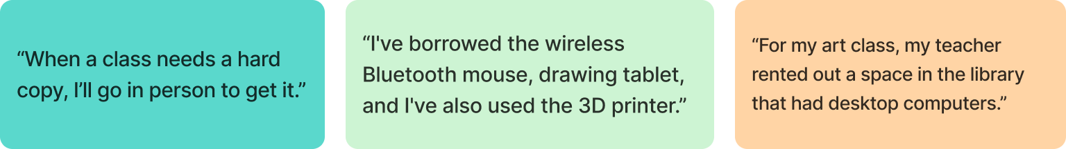
Students who engage with the libraries in person often note their main use case being using the space to study. These students often book rooms or just show up to the spaces to study on their own and with friends. Further, people go in person to use the various tech available (printers, computers, etc.) - especially when students are unable to complete tasks for class without library resources. Finally, people are drawn to the library due to the Starbucks within.
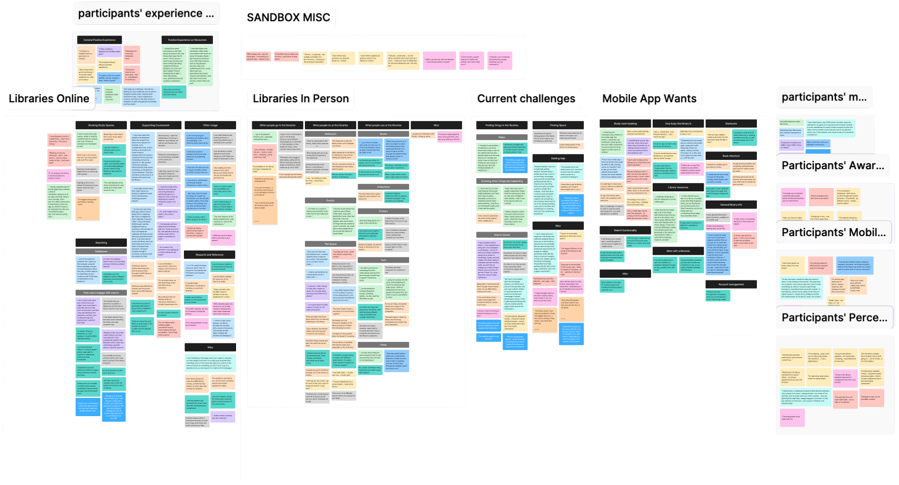
Students engaging with the libraries online often use the search feature to utilize online books, articles, and databases. Most students have had an experience where a professor has instructed them to use the libraries for readings or other reference. Students also will use the libraries online to book study rooms and get answers to FAQs.