Advanced Interaction design is a class focused on concepts of high fidelity designs, design systems, and interactions within UX design. The course is split into two large assignments. The first being a responsive website and the second a dedicated mobile app.
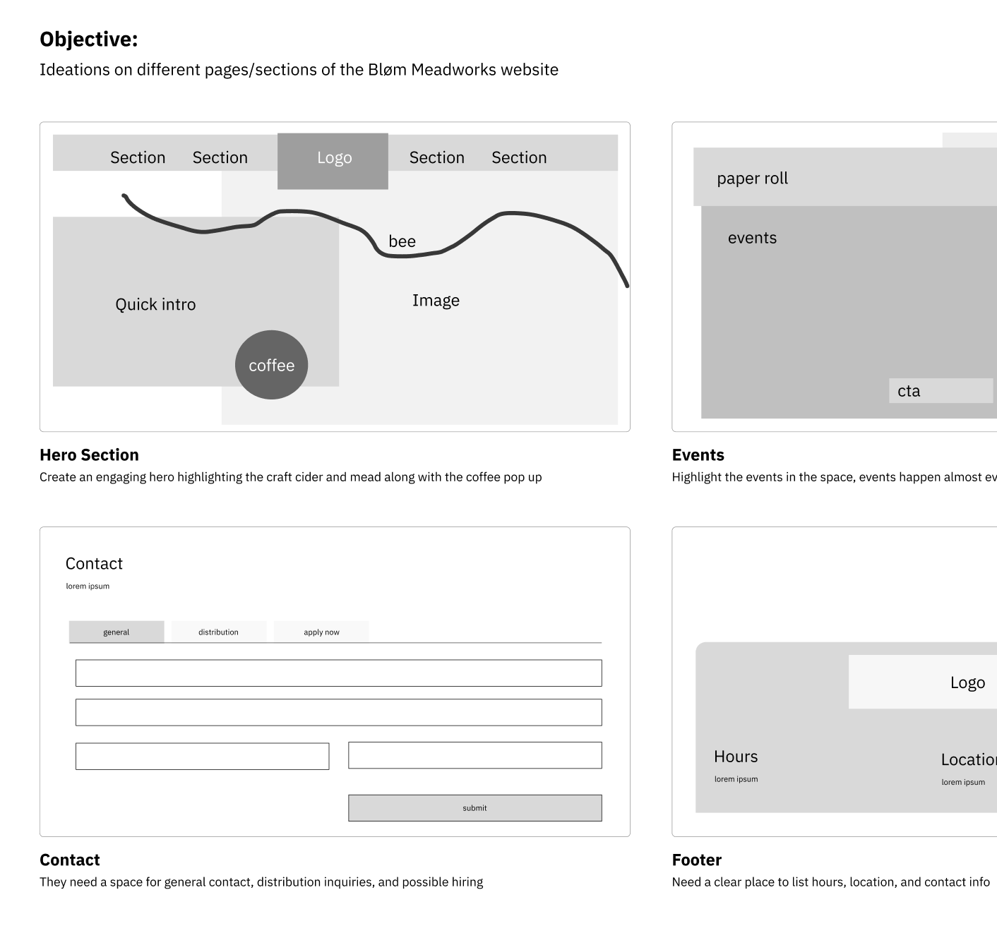
As always, the best place to start with any redesign is to iterate on some ideas. My goal for this project was to introduce elements that were found within the meadery into the website. The physical space focuses on community events. The space is bright, open, and welcoming. When making these sketches using Figma Draw, my goal was to focus on those components that make the space so great.
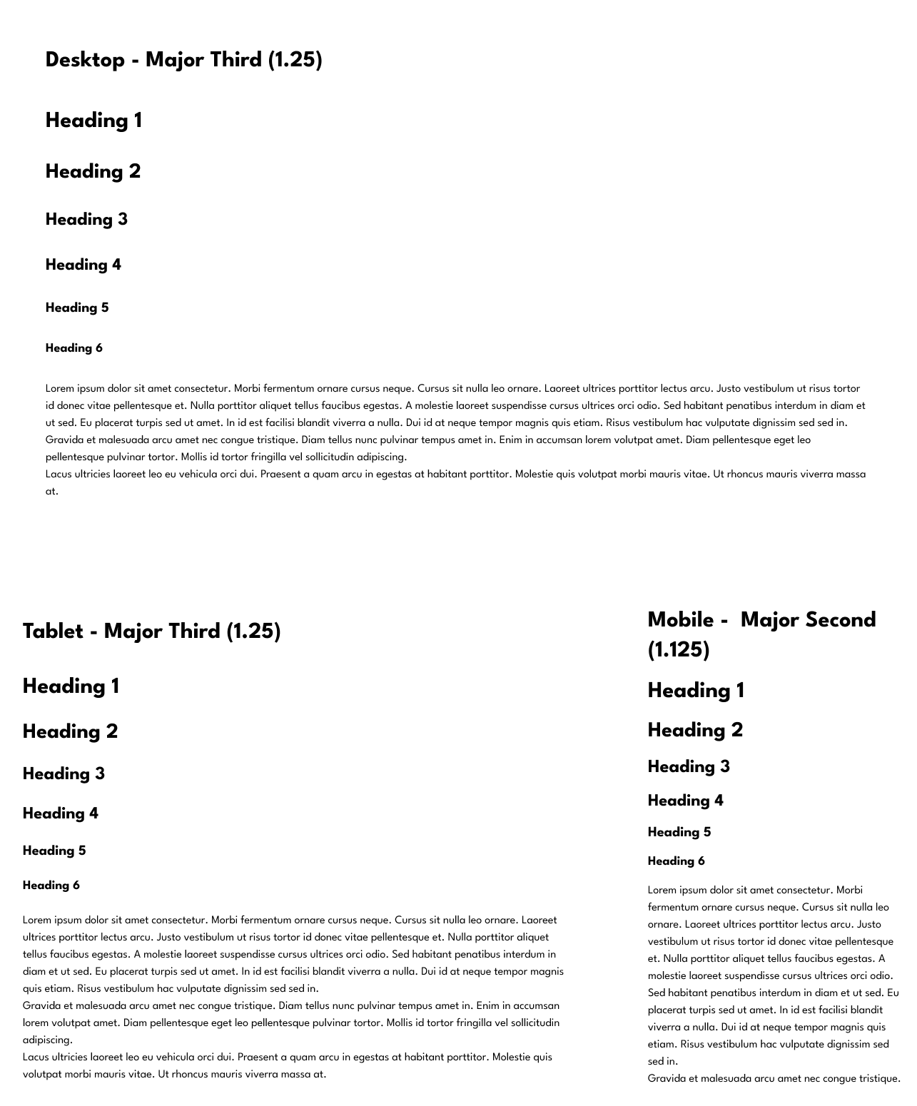
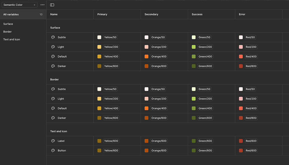
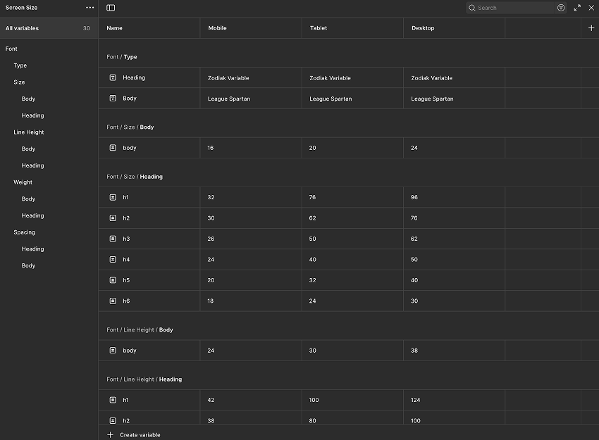
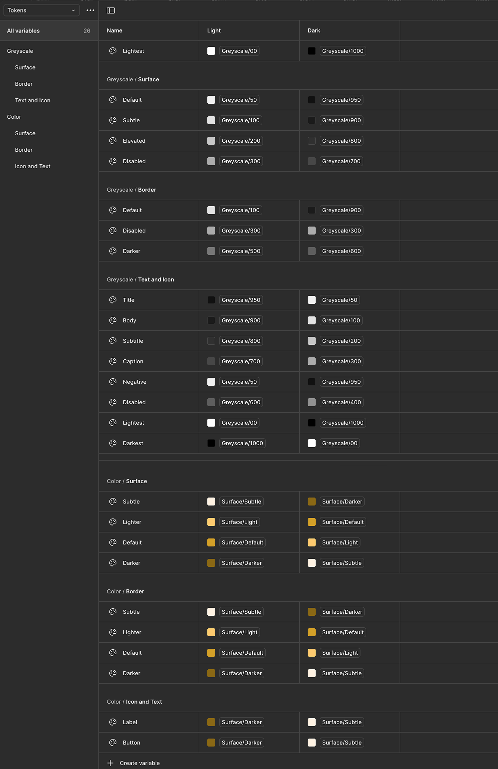
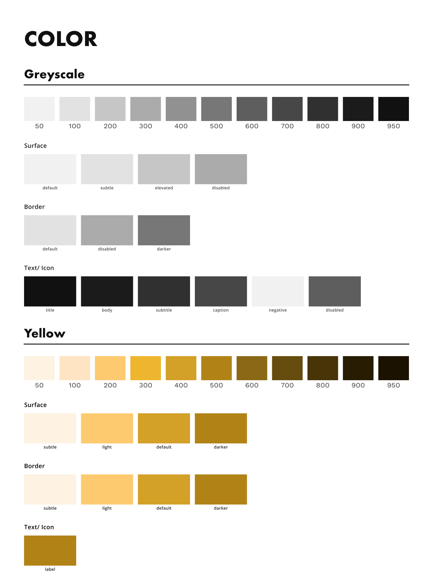
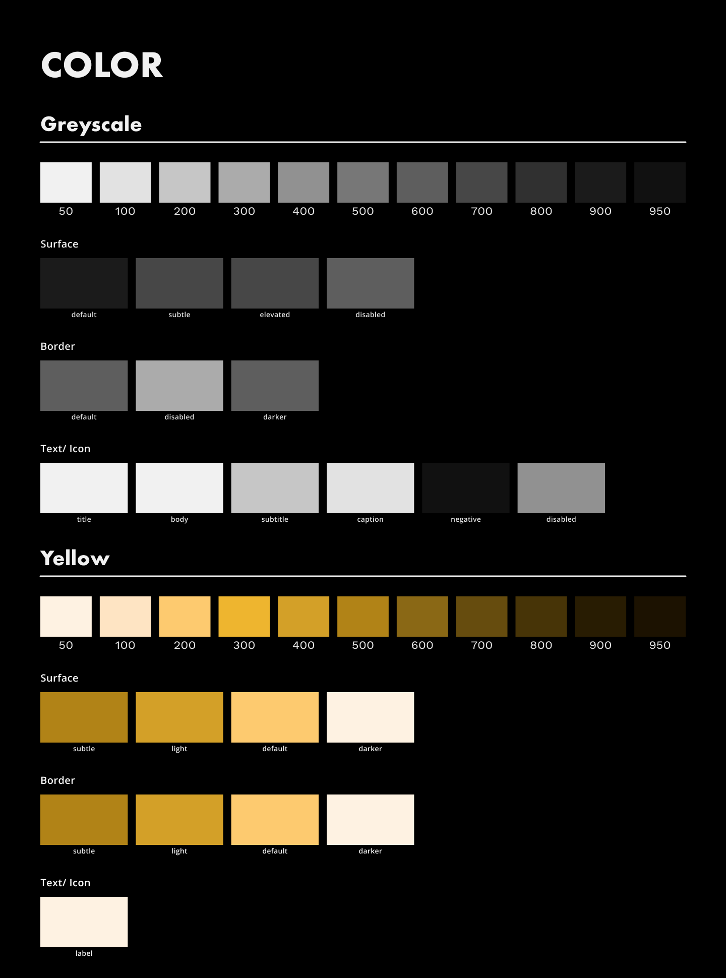
After some sketching, it was time to develop the brand identity. The goal of the project is to have a fully responsive site, and using typographic scaling and semantic color values is the easiest way to achieve this. After determining the typeface and color palatte of the site, I turned to using the variables panel within the Figma space. I created a primitives panel for color and numerical values, a semantic color panel for color states, tokens for specific usages within the designs, and a screen size panel for the automatic updating of typographic values based on the size of the frame.


Semantic color that takes from primatives

Typographic values allowing for easy updates between screen sizes

Tokens take from semantic color for easy change from light to dark


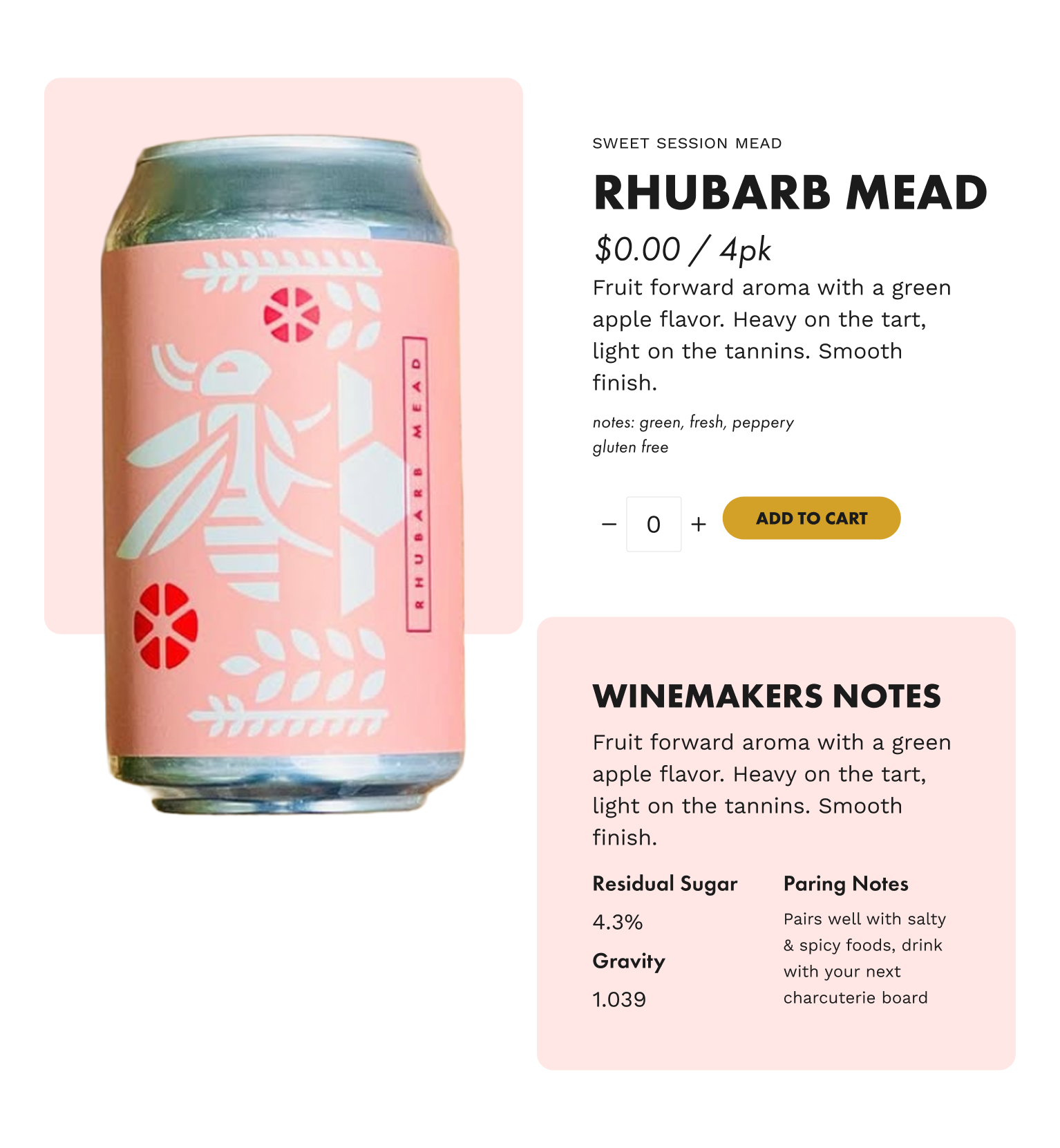
After creating the styles for the site, it was time to start putting them together. I created multiple molecules for the designs. These included buttons, cards, a navbar and more. I made sure to connect each variable to the molecules so they would be fully responsive in the final desings.

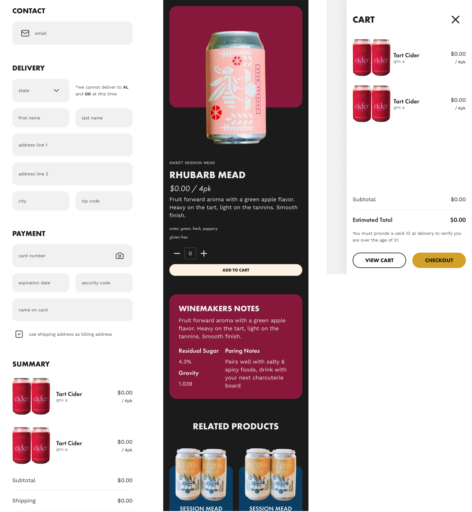
After creating smaller molecules, it was time to continue the practice of atomic designing. By using smaller elements like buttons, specific font values, and colors, I created multiple smaller sections of the page. These sections then combine to create templates to be reused throughout the design. These templates became the heart of the rest of the design, as they gave me a jumping point into the rest of the pages.


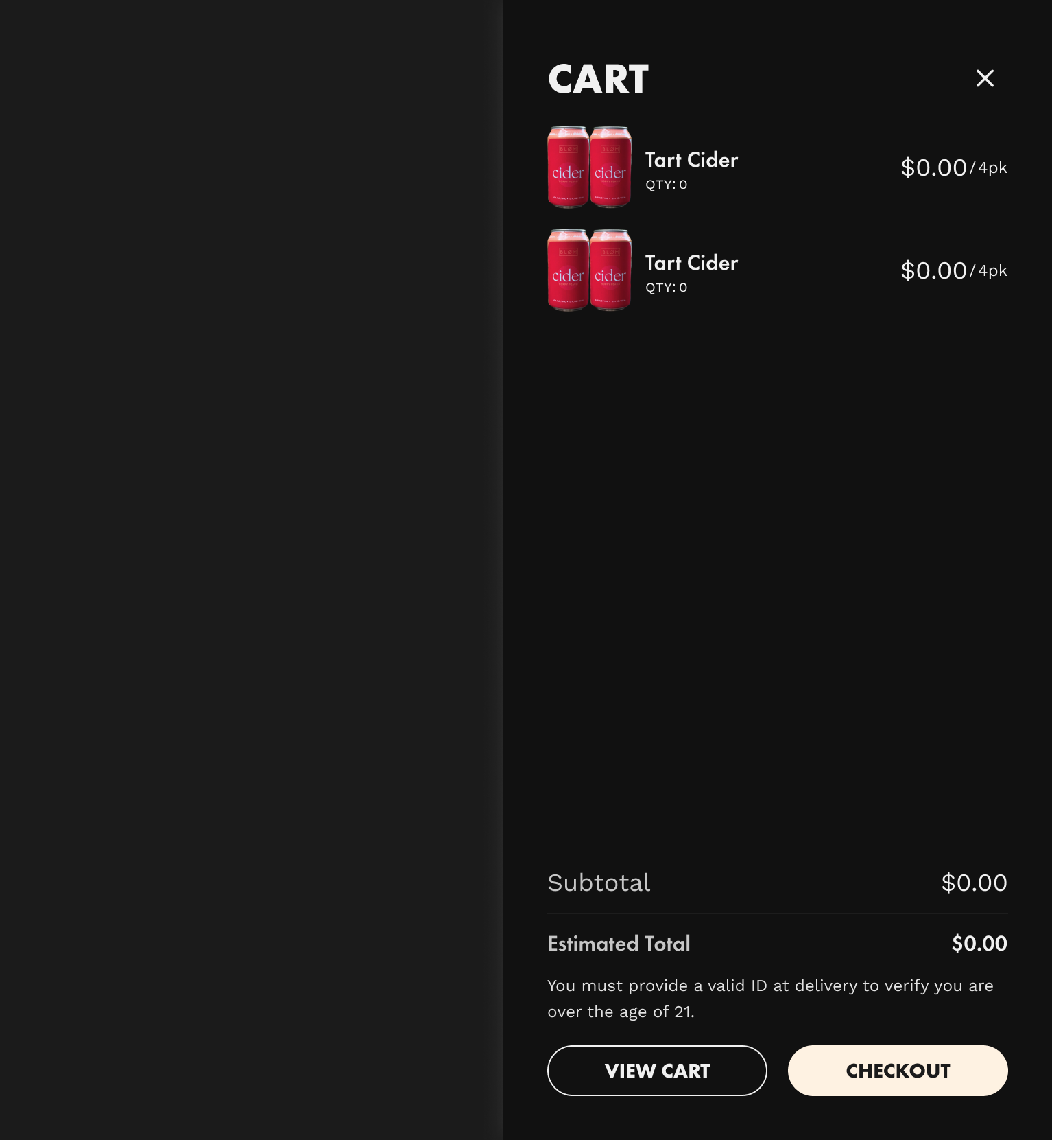
Since I made sure to connect every variable value within the light mode designs, the only thing I had left to do to create a dark mode was to flip a switch. This also made the small adjustments that needed to be made rather easy, as all I had to do was update a small value in the variables panel, and it would change everywhere. Although the physical space matches more closely with the light mode designs, adding a dark mode for user preferences is an easy update to make.


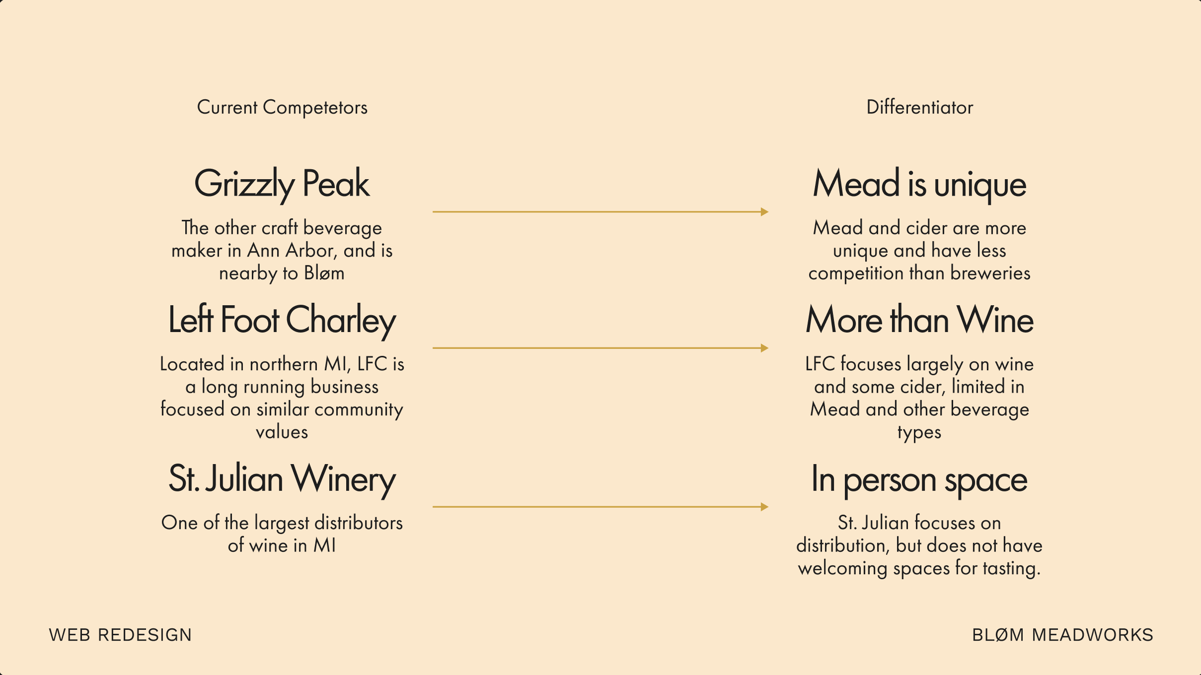
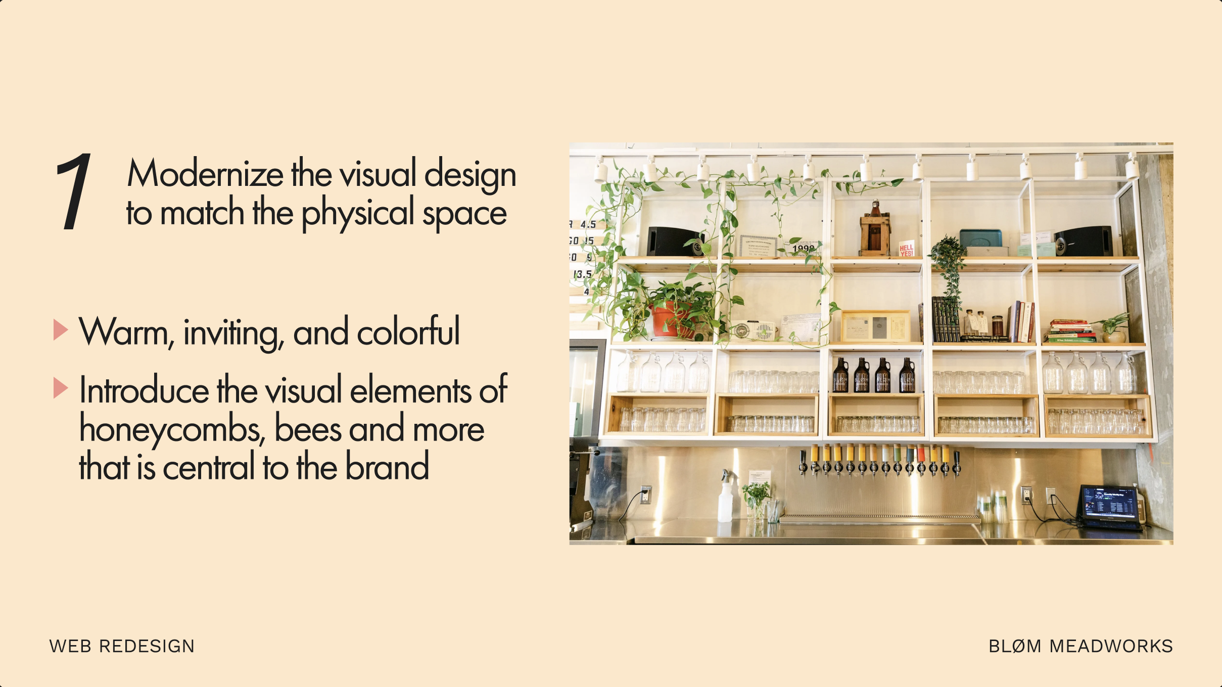
The final deliverable of the project was to create a pitch deck documenting the competitors, the design goals, and overall updates. This deck allowed for me to share the reasoning behind some choices, and show off how the proposed changes will ultimately support the buisness.