Client Brief
What's Going wrong?
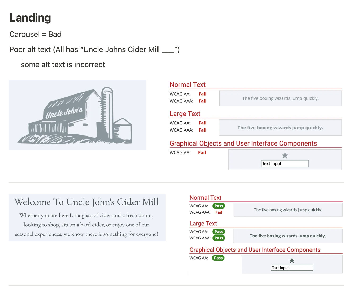
To adequately understand what issues the company is facing with their digital experience, I completed a simple audit of the website pages. Mainly just notes, it was important for me to give the client reasoning as to why contrast issues and alignment differences is a problem, as they have no history with web design and accessibility. I met with the client with these findings and went page by page to understand the issues they were having as well. This became the support to my digital redesign.
Key Takeaways
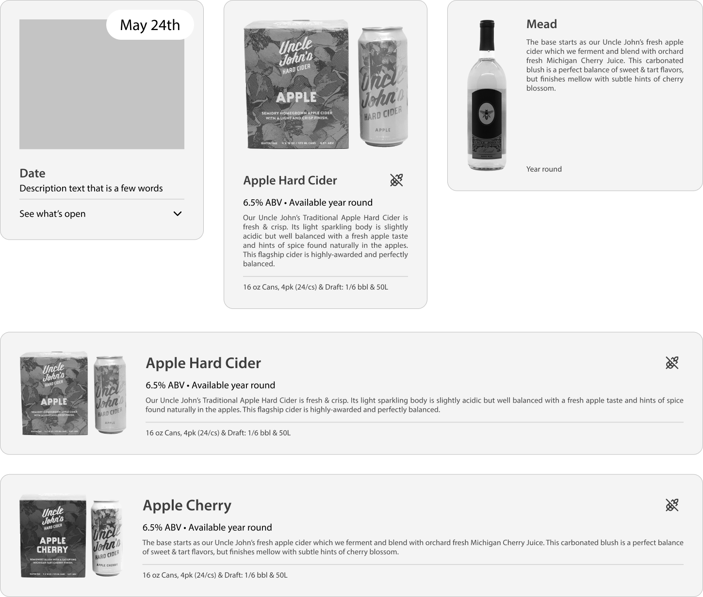
Too Much Text
Makes users skip valuable information with a lack of visual appeal
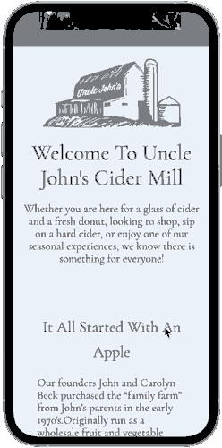
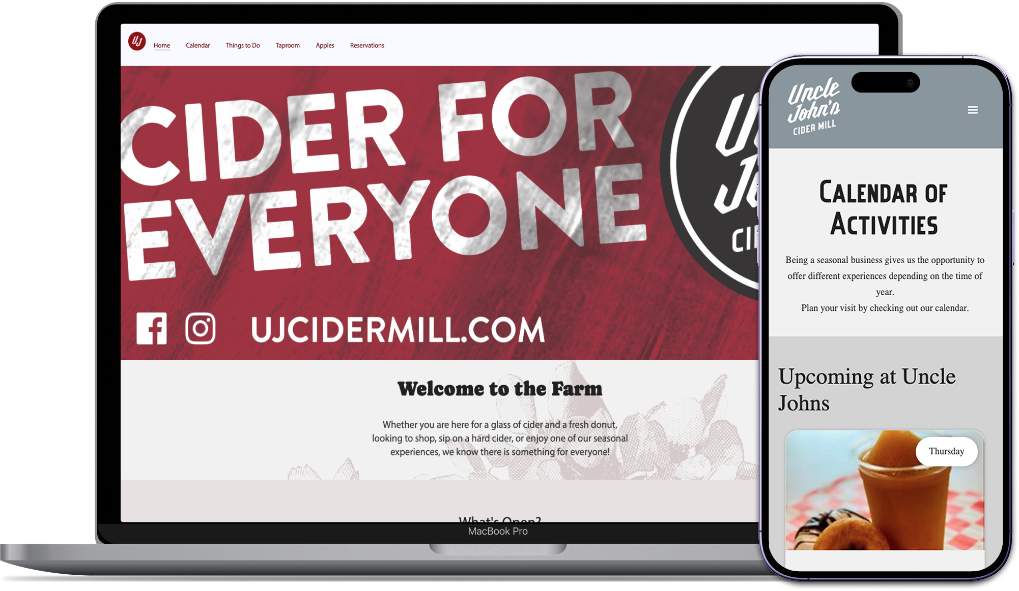
Landing Page
Broken Components
Components do not work or have poor visuals
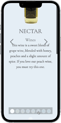
Taproom Options
Accessibility Issues
Contrast issues, poor alt text, and unresponsive design
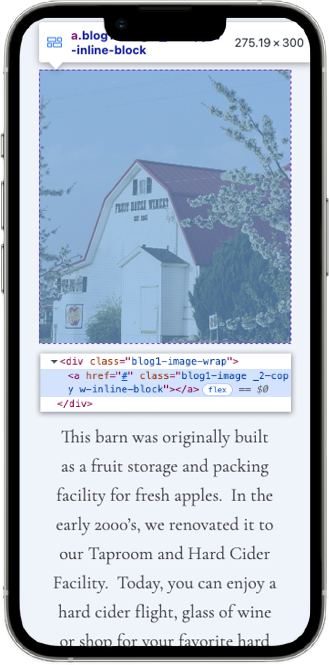
Barns Page